
Quiet Light, Confident Luxury
Today we explore understated lighting strategies for calm, high-end interiors, focusing on gentle layers, precise control, and materials that glow rather than glare. Expect practical techniques, elegant anecdotes, and designer-tested insights that help every surface feel intentional, serene, and quietly luxurious. Share your questions and lighting wins to shape future conversations, and consider following along for future deep dives into techniques that make refined spaces feel naturally restorative and beautifully alive.
The Quiet Power of Layered Light

Ambient: The Soft Canvas
Begin with broad, diffuse light that brushes ceilings and walls, not faces. Indirect coves and concealed linear LEDs at 2700–3000K lift volume and calm edges, while high-CRI sources keep materials honest. Aim for even, low-contrast pools that dim to one percent, letting evening scenes settle gently. Ask yourself whether the glow feels breathable, like moonlight, rather than assertive, like stage lamps.

Task: Precision Without Glare
Refine clarity with controlled beams and deep regress to protect comfort. Use baffles or lensing for cut-off; keep unified glare ratings low for long reading or cooking sessions. Favor CRI 90+ with tight beam shaping above work zones, and maintain gentle contrast ratios around 3:1 to 5:1. The goal is crisp visibility that never feels interrogative, partnering quietly with hands and eyes.

Accent: Whisper-Level Drama
Introduce delicate emphasis that breathes life into texture and art without screaming for attention. Narrow 10–25° beams add sculptural depth; wall-washers create tranquil continuity. Keep dim levels generous at night, often between five and twenty percent, and target artwork around thirty degrees to tame reflections. Choose CRI 95+ for pigment fidelity, allowing warmth and shadow to speak in calm, confident tones.
Color, Temperature, and Mood
Color temperature is emotional architecture. Warmer settings invite rest; slightly neutral tones support focus without harshness. In refined rooms, consistency matters, so harmonize correlated color temperature across layers and consider dim-to-warm for evenings. Let the light evolve through the day in gentle steps that echo circadian comfort. When everything matches the intention, materials and minds exhale in quiet relief.
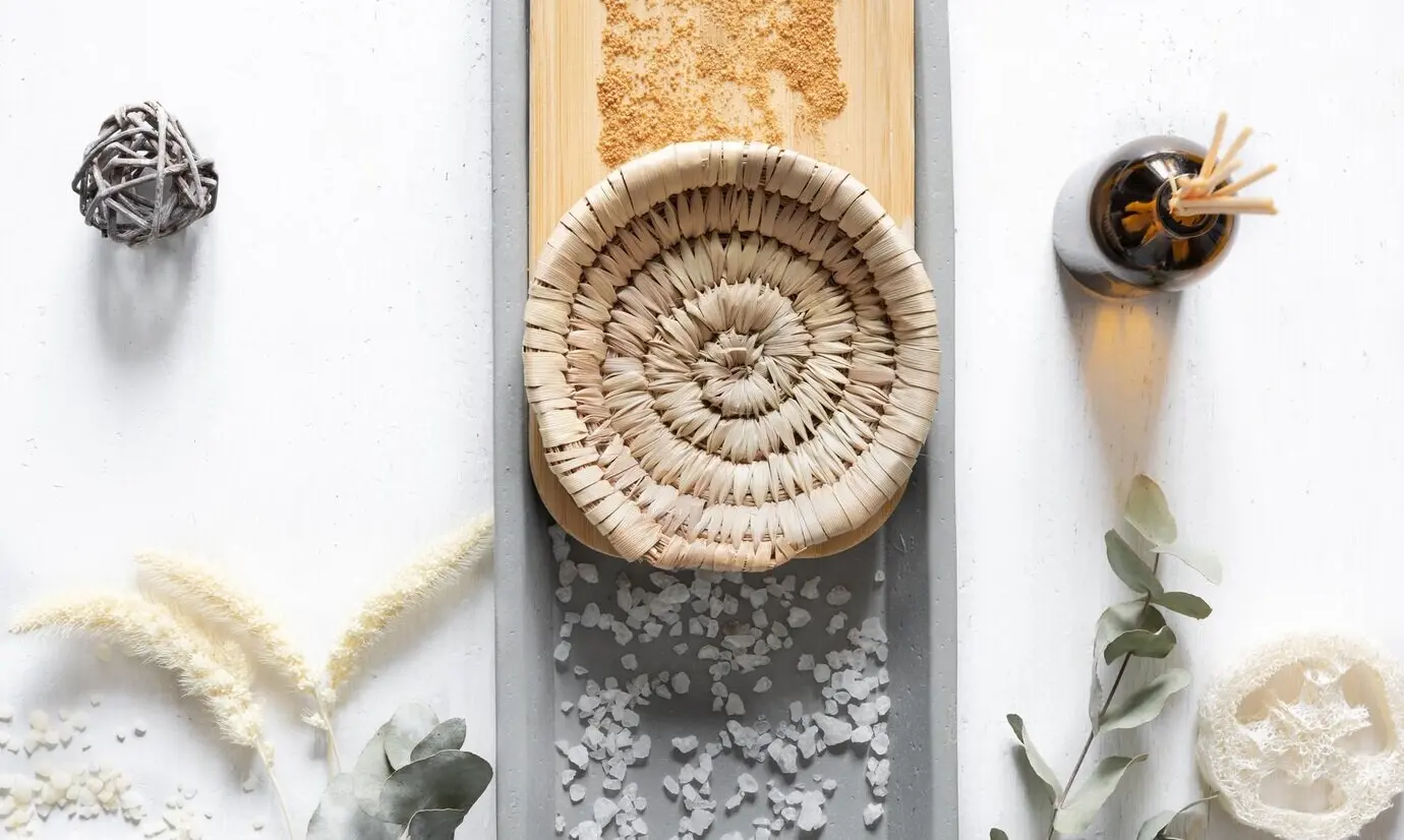
Materials That Glow, Not Glare
Softening Surfaces and Finishes
Select diffusive shades and tactile finishes that scatter brightness. Linen drums, woven silks, sandblasted glass, and alabaster transform points into clouds. On walls, limewash or mineral paints absorb and glow, avoiding plastic shine. Even brushed brass or bronze can feel hushed when paired with warm sources. Share photos under real conditions before committing, and adjust until reflections whisper, not shout.
Lens and Diffuser Choices
Microprismatic lenses, opal diffusers, and softening films control sparkle while keeping output efficient. Deep regress trims and snoots guide beams without calling attention to hardware. Evaluate cut-off angles around thirty degrees to protect sightlines, and test for uniformity on counters and art. When the light looks poured, not sprayed, you’ve found the quiet confidence high-end spaces deserve.
Harnessing Reflectance and Shadow
Use high reflectance ceilings and light-toned walls to bounce ambient layers, then welcome shadow to sculpt depth. The classic 80/50/20 reflectance guideline still calms contrast. Gentle wall-washing can replace center-hot fixtures, while toe-kick grazes lift cabinetry weightlessly. Observe how evening shadows travel across stone veining and fabric weaves, and fine-tune aiming until the room breathes like a slow, contented sigh.
Architecture as the Luminaire
When light becomes part of the architecture, serenity follows. Recessed channels, reveals, and coves disappear into structure, delivering glow without visual chatter. Millwork-integrated lines, stair grazes, and ceiling slots guide movement quietly. With proportion, sightlines, and maintenance in mind, the envelope itself becomes a gentle instrument—one you feel, but rarely notice, except in how calm it leaves you.
Invisible Integration
Place linear LEDs within shadow gaps, cabinet undersides, and plastered coves so light appears source-less. Favor continuous diffusers that hide diodes, and coordinate with carpenters early for crisp reveals. Toe-kick illumination stabilizes night navigation without glare. The effect is civilized, like soft music in another room, allowing textures and shapes to lead while hardware fades into silence.

Proportion and Sightlines
Restraint loves good geometry. Keep slots aligned with architectural axes, avoid fixtures in primary sightlines, and respect beam cut-off to shield eyes while seated or reclining. Scale coves to ceiling height so gradients feel natural. If a fitting is visible, ensure it is intentionally beautiful. Walk the space, sit, and lie down; re-aim until the eye encounters glow, not glare.
Scene Setting for Serenity
Design a handful of scenes that anticipate life: Wake, Prepare, Dine, Unwind, Night. Each balances layers, color temperature, and brightness so moods change without fuss. Keep naming intuitive and buttons few. During the first month, adjust timings and levels based on how the space feels at real hours, and invite feedback from visitors to refine hospitality and ease.
Smooth Dimming and Compatibility
Insist on drivers and controls that dim smoothly to one percent without shimmer. Match protocols—ELV, 0–10V, DALI—to fixtures for predictable curves, and check low-flicker performance against recognized guidelines. Dim-to-warm restores candlelike comfort at night. Test mixed loads together on-site, then document winning pairings. When the fade is liquid and silent, the room’s hush becomes unmistakably luxurious.
Interfaces and Habits
Choose restrained keypads with engraved labels and gentle backlight, placing them where the hand naturally reaches. Keep app controls available yet unobtrusive, prioritizing tactile certainty over screens. Program a master Goodnight that secures the home in one touch. Encourage residents to note moments that feel too bright or too dim, then iterate. Calm grows through attentive, human-centered tuning.
Controls That Disappear
The most elegant controls feel like intuition. Scenes replace switches, dimming feels analog, and automation respects human preference. From low-flicker drivers to tactile keypads, the technology should vanish into quiet reliability. Thoughtful commissioning ensures mornings arrive gently, evenings fold softly, and guests understand the room without instructions. Simplicity becomes a daily luxury you notice only when it’s absent.
Stories from Tranquil Homes
{{SECTION_SUBTITLE}}
Penthouse at Dusk
A west-facing living room once flared with reflections at sunset. We introduced concealed coves, softened metals, and dim-to-warm floor lamps. Accent beams framed art at thirty degrees, while sheer drapery calmed the glare. The family now reads as the city glows outside, feeling held by light that neither presses nor fades, a hush that honors the view and conversation.

Mountain Retreat, Winter Morning
Stone, timber, and snow needed warmth without heaviness. Linear grazes kissed beams, toe-kicks lifted cabinetry, and alabaster pendants pooled gentle brightness over breakfast. Controls brought the house alive before dawn, then yielded to daylight by noon. With high-CRI lamps, knotty wood felt honest, not orange. Guests describe the light as a fire’s embrace, without any smoke or fuss.
All Rights Reserved.